Developing for Web and Mobile
When working with clients as a developer it’s important to understand the full expectations of your application. This can include key features for the app to be functional. It’s also important to understand how your client assumes the users will interact with your product. One key feature I learned near completion that was a non-negotiable was ensuring users can log in either on their computers or mobile devices. In fact, they assumed most people would be utilizing their cell phones as a means to access the application.
Learning this while nearing the launch of the product I needed an quick and easy way to make the website fungible for mobile usage. It was there that I discovered CSS Media Queries. The implementation with the MaterializeCSS library made it pretty seamless and easy.
MaterializeCSS has built in class names that implement certain features for based on the size of the screen. As an example, I needed to adjust the navbar for my application given this was the result without taking into consideration mobile usage:
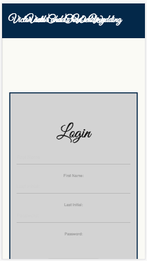
Here I’m using the Chrome developer tool to view it from a mobile perspective. The image below shows what the navbar looks like from a regular desktop:
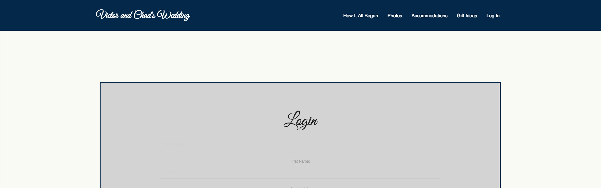
Because the screen size is significantly smaller the menu items on the right are overlapping with the logo. Obviously this is not what we want as developers.
What we’ll need to do is hide the regular navbar menu once the size of the screen reaches a certain pixel width. MaterializeCSS has built in class names that remove elements based on that exact criteria by adding hide-on-med-and-down to our class name. Now that we’ve removed it let’s go ahead and add some elements if the user is viewing the application from their mobile device. Here’s what our final navbar code looks like
var mobileNavElement = localStorage.token ? <a href="/" data-activates="mobile-demo" className="button-collapse brand-logo headline-text left">Victor and Chad's Wedding<i className="material-icons">menu</i></a> : <a data-activates="mobile-demo" className="button-collapse brand-logo headline-text left">Victor and Chad's Wedding</a>

  return(
    <div >
      <nav>
                <div className="Main-header">
                    <div className='container'>
                      <div id='navbar-row' className='row'>
                        <a href="/" className="brand-logo headline-text hide-on-med-and-down center">Victor and Chad's Wedding</a>
                        {mobileNavElement}
                <ul id="mobile-demo" className="side-nav">
                  <li><Link to="/">Home</Link></li>
                  <li><Link to="/whereitallbegan">How It All Began</Link></li>
                  <li><Link to="/photos">Photos</Link></li>
                  <li><Link to="/accommodations">Accommodations</Link></li>
                  <li><Link to="/giftideas">Gift Ideas</Link></li>
                  <li>{form}</li>
                </ul>
                <ul id="nav-mobile" className="right hide-on-med-and-down">
                  <li><Link to="/whereitallbegan">How It All Began</Link></li>
                  <li><Link to="/photos">Photos</Link></li>
                  <li><Link to="/accommodations">Accommodations</Link></li>
                  <li><Link to="/giftideas">Gift Ideas</Link></li>
                  <li>{form}</li>
                </ul>
                      </div>
                    </div>
                </div>
          </nav>
      </div>
  )
The {mobileNavElement} variable is what should render if the user is logged in or not It either has a collapsible icon when they’re logged in, or it does not.
Additionally, we’ve gone ahead and added a side navbar to render only if the app is being viewed on a mobile device.
<ul id="mobile-demo" className="side-nav">
  <li><Link to="/">Home</Link></li>
  <li><Link to="/whereitallbegan">How It All Began</Link></li>
  <li><Link to="/photos">Photos</Link></li>
  <li><Link to="/accommodations">Accommodations</Link></li>
  <li><Link to="/giftideas">Gift Ideas</Link></li>
  <li>{form}</li>
</ul>
These are the items in the side navbar that appear once the user selects the logo or collapsible menu icon.
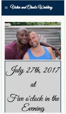
Now you can see the collapsible icon rendering and the user interacting with the side navbar when selecting that icon.
The other catch is now with our styling. Given most of the element classes are staying the same we need a way to edit them based on which view is being accessed by the user. Here is where we’ll need to use the CSS Media Queries to change those elements while the application is in mobile mode.
In our CSS file we’ll add this line of code and all of our CSS editing within it that will only take place once the screen size has reached 480 pixels:
@media only screen and (max-device-width: 480px) {}
Inside the curley brackets is where you’ll be adding all of the CSS styling necessary when the user is interacting with your application on a mobile or tablet device.
Questions or comments? Feel free to shoot me an email (click the link below).